
Keywords: color psychology branding, brand color guide, color selection tips
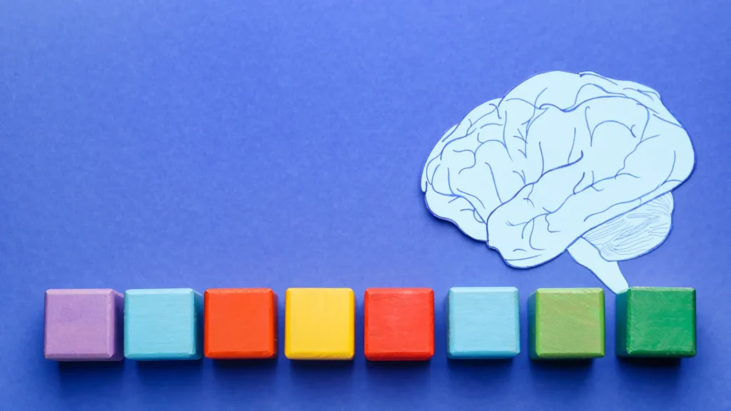
Colors do more than just beautify your brand—they influence emotions, perceptions, and even buying decisions. This is where color psychology in branding becomes a powerful tool. Choosing the right colors can help your brand communicate its values clearly and connect deeply with your audience.
In this brand color guide, we’ll explore how colors affect consumer psychology and share practical color selection tips to create a memorable and impactful brand identity.
🧠 What Is Color Psychology in Branding?
Color psychology studies how different hues influence human behavior and emotions. In branding, it’s about selecting colors that evoke specific feelings aligned with your brand’s message and target audience.
For example:
- Red can evoke excitement, passion, or urgency.
- Blue conveys trust, calmness, and professionalism.
- Green is associated with nature, health, and growth.
Using the right colors strategically can increase brand recognition by up to 80% and create emotional connections that foster loyalty.
🎯 How to Choose the Right Brand Colors: Step-by-Step Guide
1. Define Your Brand Personality
Is your brand playful or serious? Luxurious or approachable? Your brand personality guides your color choices.
- Fun, youthful brands often use bright, energetic colors like orange or yellow.
- Corporate or finance brands lean towards blues and greys for professionalism.
2. Understand Your Audience
Consider demographics like age, gender, and cultural background. Colors may have different meanings worldwide—red symbolizes luck in China but danger in the West.
3. Study Competitors
Look at competitors’ color schemes. You may want to align or differentiate depending on your strategy.
4. Choose a Primary Color
Pick one dominant color that reflects your core brand values and use it consistently.
5. Select Complementary Colors
Add 2-3 secondary colors for contrast and versatility in different media.
🌈 Common Brand Colors and Their Psychological Impact
| Color | Meaning & Emotion | Ideal For |
|---|---|---|
| Red | Energy, urgency, passion | Food, entertainment, sales |
| Blue | Trust, calmness, professionalism | Finance, tech, healthcare |
| Green | Growth, health, nature | Eco-friendly, wellness, finance |
| Yellow | Optimism, warmth, happiness | Kids, leisure, food |
| Purple | Luxury, creativity, spirituality | Beauty, education, tech |
| Orange | Friendly, adventurous, confident | Retail, sports, tech startups |
| Black | Sophistication, power, elegance | Luxury brands, fashion |
| White | Simplicity, purity, cleanliness | Health, tech, lifestyle |
💡 Practical Color Selection Tips for Your Brand
- Test colors in multiple formats: Print, digital, merchandise—colors can look different on each.
- Use color tools: Online palettes like Adobe Color or Coolors help create harmonious schemes.
- Consider color accessibility: Ensure your palette is readable for color-blind users with enough contrast.
- Limit your palette: Stick to 3-4 colors to keep your brand consistent and professional.
- Create a color usage guide: Define when and how each color should be used to maintain brand integrity.
🎯 The Role of Color Across Different Brand Elements
- Logo: Your logo’s color sets the tone for your entire brand.
- Website & UI: Colors guide user experience and actions (e.g., red for warnings, green for success).
- Packaging: Influences first impressions and shelf appeal.
- Marketing materials: Consistency in color reinforces recognition and trust.
🏁 Final Thoughts
Understanding and applying color psychology in branding can transform your brand’s impact and memorability. By choosing the right colors thoughtfully, you communicate your values, connect emotionally, and stand out in a competitive market.